I'm a UI/UX designer with a background in Information Systems, specialising in web and dashboard design. I practise user-centred design — researching what users need, planning information architecture, and crafting the visual look and feel of each product.
Coming from an engineering background, I understand how data flows and how developers think — making me a better collaborator and a stronger designer. I believe good design is invisible: when it works, users just get things done.
🎓
Education
BSc Information System UiTM Shah Alam
💼
Experience
1+ Year UI/UX + Engineering
📍
Location
Selangor, Malaysia
🌐
Language
Malay (Native) English (Proficient)
My Skills
Figma & Prototyping85%
Wireframing & User Flows80%
Design Systems & Tokens75%
HTML / CSS78%
UX Research & Personas65%
Handoff Documentation80%
My Work
Featured Projects
Real enterprise, government, and concept projects — spanning web, portal, and mobile surfaces.
🏢Real Project01
Prowira Graduan
Weststar · Protege Management System
Multi-role system for admins, managers, and proteges with distinct dashboards and workflows.
DashboardMulti-Role UXFigma
View Case Study →
🌙International02
HALO Timor-Leste
Weststar · National Halal Certification
3-surface platform — public website, certification portal, and Flutter mobile app with unified design system.
Design SystemMulti-SurfaceGovernment
View Case Study →
✦Real Project03
WGHTC Landing Page
Weststar Global Halal Trading & Certification
Conversion-focused marketing page guiding business visitors toward enquiry through clear IA and persuasive CTAs.
Landing PageConversion UX
View Case Study →
🖥️Real Project04
Attendance & Leave System
Weststar Engineering Sdn. Bhd.
End-to-end HR dashboard replacing manual leave tracking with a self-service system for employees and managers.
DashboardHR UXFigma
View Case Study →
🍛Concept05
NasiGo
Concept · Malay Food Delivery App
Mobile food ordering app for budget-conscious university students. Full UX process from research to wireframes.
Mobile UXUX ResearchWireframing
View Case Study →
🍽️Healthcare06
Glukosa
Academic · Reframed
Meal plan diary for diabetic patients — expert system suggests low-sugar Malay dishes based on glycemic index.
Healthcare UXExpert System
View Case Study →
📡Proof of Concept07
Meshsenger
Offline Bluetooth LE Mesh Messenger
Directed and integrated AI-generated design output into a Flutter proof-of-concept — a serverless mobile messenger that relays messages phone-to-phone over Bluetooth LE with no internet or accounts.
Prowira Graduan is Weststar Engineering's internal management platform for the national protege (graduate trainee) programme. It serves three distinct user roles — proteges, managers, and HR admins — each with different information needs, permissions, and workflows. My role was to design the full UI across all three role views, ensuring each user could complete their tasks without confusion.
🎯
My Role
UI/UX Designer — sole designer on the project from wireframe to final handoff.
"Managing protege progress, task assignments, and evaluations was scattered across emails and spreadsheets — with no single place for managers to track progress or proteges to know what was expected of them."
01
No Centralised Tracking
No dashboard for managers to see protege progress, task completion, or upcoming evaluations at a glance.
02
Role Confusion
Proteges, managers, and admins all needed different views — a one-size interface would fail each group.
03
No Progress Signal
Proteges had no way to see how they were performing or what milestones remained in their programme.
Solution
The Solution
👥
Role-Based Dashboards
Three distinct home screens — each showing only what that role needs to see and do.
📊
Progress Visibility
Timeline bar on the protege dashboard showing programme completion % and upcoming milestones.
🧩
Unified Component System
Same card, table, and button components across all roles — consistent language, different content.
Typography & Colour
Visual Language
Typography
Heading Style
DM Serif Display — headings & display text
Body & UI Text
Plus Jakarta Sans — body, labels, UI
[ Add your actual Figma typography tokens here — font sizes, weights, and line heights used across the system ]
Colour Palette
#3366F0
Primary Blue
#E8EFFE
Blue Light
#12101E
Dark
#F2F1F8
Surface
[ Add your actual Figma colour tokens — replace swatches above with exact brand colours used ]
UX Research & Insights
Research Approach
🗺️
Role Mapping
Mapped out what each of the 3 user roles needs to see and do before designing any screens — preventing assumptions from driving layout decisions.
👁️
Workflow Observation
Observed how protege progress was currently tracked via email and spreadsheets to understand pain points first-hand before proposing solutions.
Key Insights
3
Distinct user roles each with completely different data needs and interaction patterns
0
Existing digital touchpoints — everything was managed via email and spreadsheets
#1
Pain point: proteges didn't know what was expected of them week to week
Design Challenges
Designing for 3 roles without fragmenting the system
The biggest challenge was making three distinct dashboards feel like one coherent product. Too much differentiation risks inconsistency; too little means no role gets the focused experience they need. The solution was a shared component library with role-specific content rules — same building blocks, different assembly.
Balancing complexity with simplicity for less tech-savvy users
Some admin users had limited digital literacy. Designing for them without dumbing down the system for power users required careful progressive disclosure — surfacing only what each role needs at each step, not everything at once.
Design Takeaway
What This Project Taught Me
01
Always start with user flows before wireframes. If you don't understand what each role needs to accomplish, you risk designing screens that look good but serve nobody well.
02
A shared component library makes multi-role systems feel coherent rather than fragmented — and saves significant dev time during implementation.
03
Progressive disclosure is a powerful tool for mixed-literacy user groups — show what's needed at each step, not everything at once.
My Users
User Persona
👩💼
Izzah, 24 — Protege
Fresh graduate · 12-month programme · First corporate job
"I just want to know what I'm supposed to do this week and whether I'm on track."
✅ Goals
→ See tasks and deadlines clearly
→ Submit reports without confusion
→ Track progress toward completion
😤 Frustrations
→ Not knowing what's expected
→ No feedback loop from manager
→ Unclear evaluation criteria
User Flows
How Each Role Navigates
🗺️
Add your Prowira user flow diagram here Show the 3 separate role flows (Protege / Manager / Admin) and where they intersect Export from Figma and drop the image here
Low-Fidelity Wireframes
Structure Before Style
🗺️
Role Flow Mapping
✏️
Protege Dashboard Wire
✏️
Manager Dashboard Wire
[ Add your actual lo-fi wireframe screenshots here — export from Figma at greyscale and drop them in ]
Grid & UI Kit
Grid System
[ Describe your grid — e.g. 12-column grid at 1440px desktop, 4-column at 768px tablet, 1-column at 375px mobile. Add a screenshot of your Figma grid template. ]
UI Kit Components
Components built: Navigation sidebar, Role badges, Task cards, Progress bar, Status chips (Active/Pending/Complete), Data tables, Action buttons, Form inputs. [ Add Figma component screenshot ]
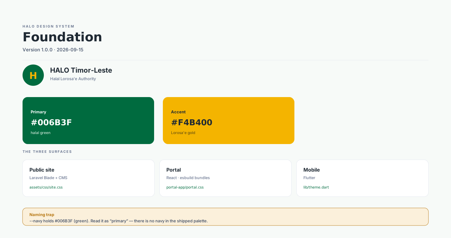
HALO (Halal Lorosa'e Authority) is Timor-Leste's national halal certification body built by Weststar, designed to certify Timorese products and premises to MS 1500:2019 standard and pursue Gulf and ASEAN market recognition. I directed AI as a design tool throughout — prompting, evaluating, and refining output across all three digital surfaces — while owning and quality-controlling every design decision.
The unique challenge was contextual judgement that AI cannot make. All UI copy, legal references, and payment flows had to be adapted to Timor-Leste's specific context — Portuguese language, USD currency, Lda. legal form, BNCTL/BNU payment rails, 13 municípios — requiring research and human direction at every step.
🤖
AI-Directed Design
Used AI as a tool throughout — prompting, evaluating, refining. All design decisions owned and quality-controlled by me. Output integrated into HTML/CSS prototypes and handoff documents.
📐
Surfaces
Public website · WHIP certification portal (Laravel + React) · HALO Empresas mobile app (Flutter) — 3 coordinated surfaces with one unified identity.
🔒
Design System
Locked CSS token-based palette enforced across all AI-assisted contributions. No new colours ever introduced. Source Serif 4 + Inter + Amiri (Arabic حلال only).
Problem
The Problem
"Timor-Leste had no digital infrastructure for halal certification — companies had no online way to apply, track progress, or verify certificates. The platform also had to look credible enough to support Gulf market recognition."
01
Zero Digital Infrastructure
No existing system — everything designed from scratch for a brand new institutional context in a non-Malaysian country.
02
3 Surfaces, 1 Identity
Website, portal, and mobile app all had to feel like one brand while serving fundamentally different user needs.
03
International Credibility
Design had to signal authority to Gulf and ASEAN markets — not just local Timorese users.
Solution
The Solution
🔒
Locked Design System
CSS token-based palette locked from day one — green #013D24/#006B3F, gold #F4B400, cream #f4f1e9. No exceptions.
📜
Anti-Forgery Certificate
Guilloché pattern, microtext, decorative QR, active/suspended status pill — signals international credibility.
📋
Structured Handoff
handoff.md, CMS spec, and QA work-orders (P0–P3 tiers) — enabling async collaboration without repo access.
Design System
HALO Design System
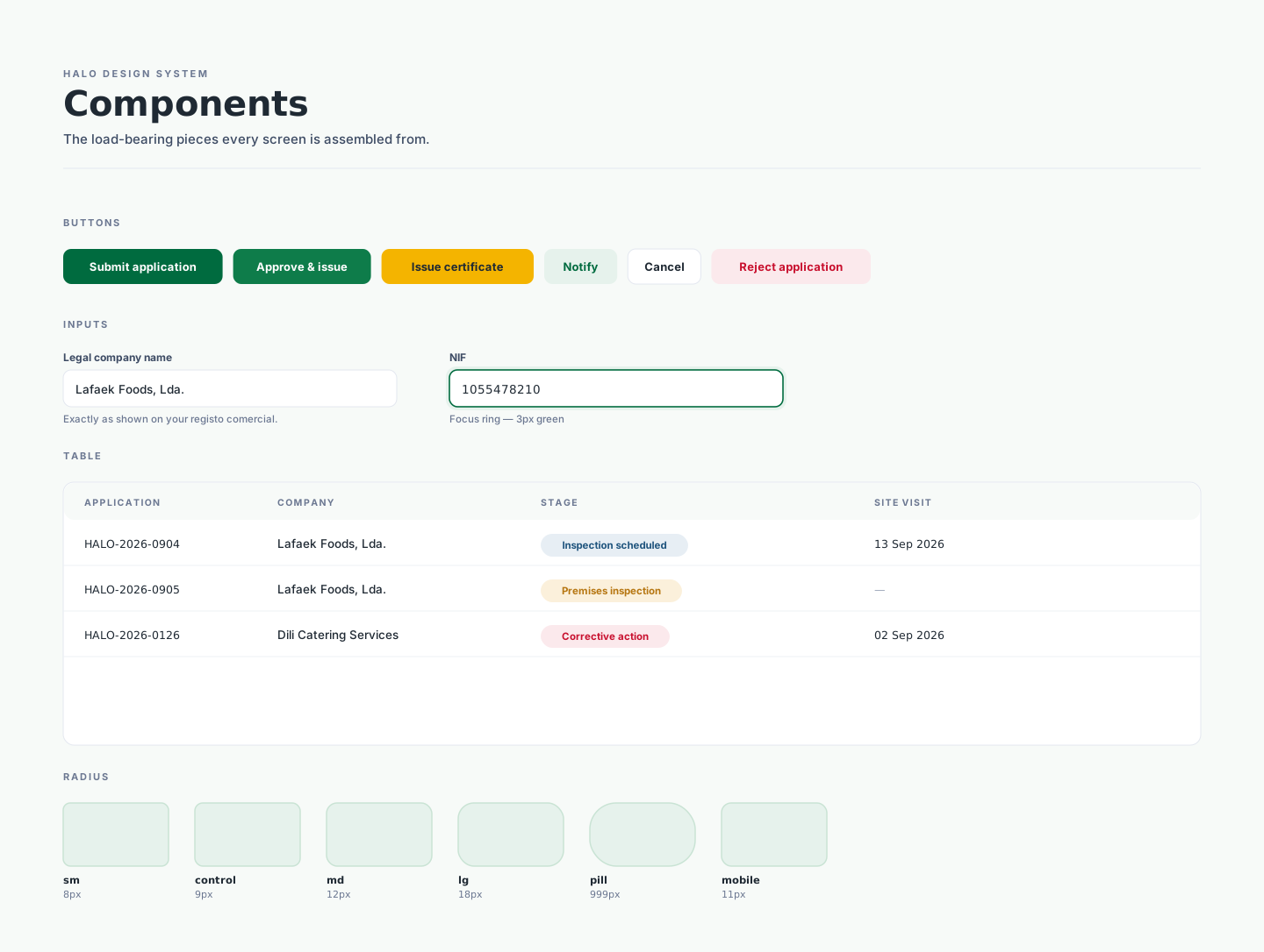
The system was extracted from the code that ships, not drawn as an intention and handed over. One tokens.json is the single source of truth; a dependency-free Node build regenerates CSS custom properties, SCSS, Flutter constants and a plain JS object from it, so a colour changed once reaches all three surfaces from one edit. Every generated file carries a DO NOT EDIT banner, and the build prints any known web ↔ mobile drift on each run — so a divergence cannot quietly survive a release.
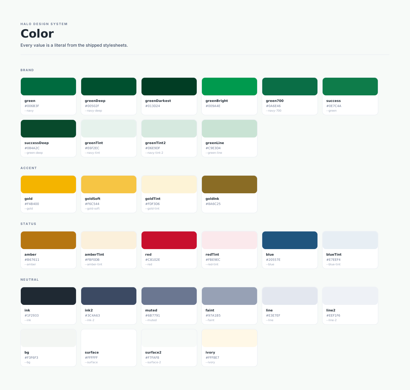
One system, three surfaces. A Laravel Blade public site, a role-driven React portal, and a Flutter mobile app — each with its own stack, all reading from the same token file. Keeping three surfaces coherent without forcing them to be identical is the whole design problem here.Every swatch carries a usage note, not just a hex. Green and gold hold brand meaning; amber, red and blue carry state only. The rule that keeps it honest: a status colour is never decorative — a red chip must mean something is actually wrong.
Two accessibility rules written into the system. Gold #F4B400 is a fill, never an ink — text on a gold tint uses #8A6C25, because gold itself fails contrast. And placeholders are format hints, never plausible values: realistic sample data in placeholders was read as saved data during testing and reported as data loss, so fields now read 10 digits rather than a convincing fake number.
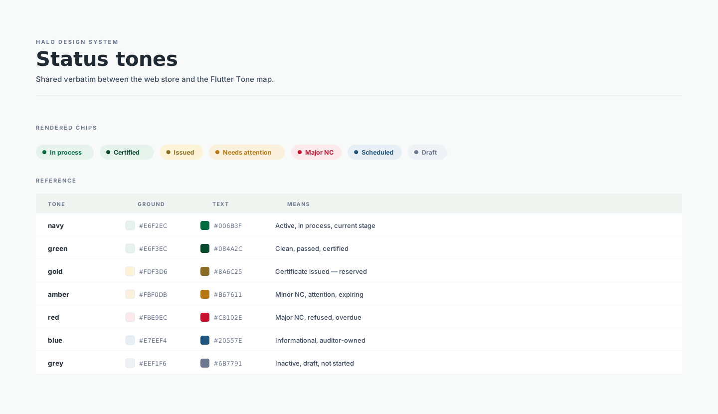
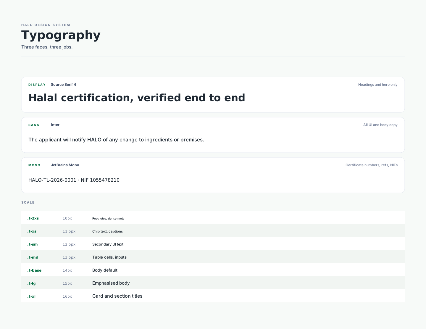
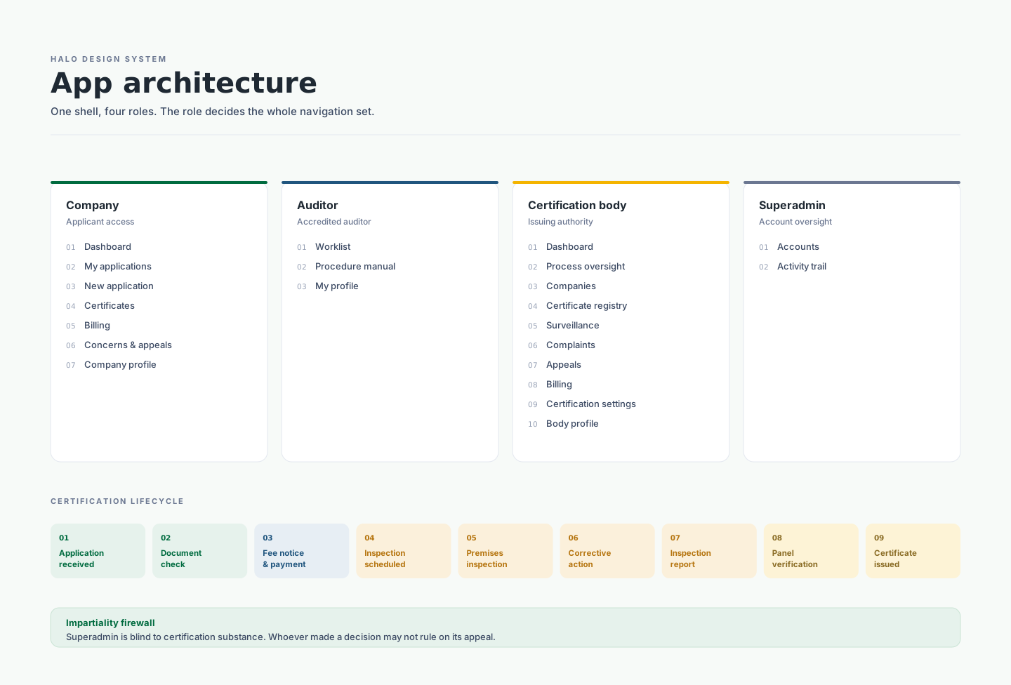
Seven tones, shared verbatim between the web store and the Flutter tone map. Each tone pairs a ground, an ink and a fixed meaning — in process, certified, issued, needs attention, major NC, scheduled, draft. Because the vocabulary is defined once rather than per screen, a certification stage cannot be styled one way on the portal and another in the app.Three faces, each with a job it never leaves. Source Serif 4 is display-only and never appears in UI chrome. Inter carries all interface text. JetBrains Mono means identifier — certificate numbers, application refs, NIFs; anything a person may need to read aloud or copy across a counter. Two faces sit outside this board by design: the Flutter app runs Plus Jakarta Sans, and the public site’s hero and tourism blocks use a scoped Fraunces / Manrope pairing with Amiri reserved for the Arabic حلال in the certification seal. The scoped override is deliberate and must never leak into the global root.Radius encodes scale and shadow is rationed. The larger the surface the softer its corner, so a component's radius follows from what it is. Cards get a 1px border rather than a shadow — elevation is reserved for things that genuinely float, which keeps a dense certification table readable instead of quilted.One shell, four roles — the role decides the whole navigation set. Company sees 7 items, Auditor 3, Certification body 10, Superadmin 2. Underneath runs a single nine-stage lifecycle from application received to certificate issued, which is what lets four very different workspaces stay recognisably one product.
The honest naming debt. The portal's primary token is --navy, and its value is #006B3F — halal green. There is no navy anywhere in the shipped palette. Rather than silently renaming a variable that live code depends on, the system documents the alias and cross-references it, so a handoff document describing a "navy brand" is identifiable as stale. The same applies to a recorded drift: web red is #C8102E while Flutter still ships #B3261E, and the build reports it on every run until someone reconciles it.
One Source, Four Generated Formats
tokens.jsonSource of truth — the only file edited
tokens.cssCSS custom properties
tokens.scssSCSS variables + tone map
tokens.dartFlutter constants + tone map
tokens.jsPlain JS/ESM object for tooling
49 tokens covering colour, the seven status tones, type stacks and scale, radius, elevation and layout widths — plus a W3C tokens file that imports into Figma as variables.
Where the Tokens Land
Public site Laravel Blade + CMS — site.css
Portal React, esbuild bundles — portal.css
Mobile Flutter — theme.dart
#006B3F
Green
#013D24
Green Darkest
#F4B400
Gold
#E6F2EC
Green Tint
#C8102E
Red
The mobile app deliberately uses Plus Jakarta Sans rather than Inter — a recorded intentional divergence, not drift.
UX Research & Insights
Research & Context
🤖
AI-Directed Design Throughout
Used AI as a tool throughout — prompting for UI sections, evaluating output against the locked design system, refining until it met quality standards. Every acceptance and rejection was a deliberate design decision.
🌍
Country Context Research
Researched Timor-Leste's legal system, payment rails, language (Portuguese primary), and regulatory context — contextual decisions that required human direction, not AI generation.
Key Insights
3
Digital surfaces designed and delivered with one unified identity
10+
Portal screens built, Playwright-verified, and handed off to the development team
2yr
Certificate validity period reflected in the UI status system (Active / Suspended / Expired)
Design Challenges
Directing AI output without losing design coherence
Using AI as a design tool means quality depends entirely on the quality of direction. Prompting without a locked design system produces inconsistency; prompting with one keeps output within bounds. Establishing the token system first made AI-assisted generation reliable and consistent across all three surfaces.
Making contextual decisions AI cannot make
AI can generate UI but cannot determine that Timor-Leste uses Lda. not Sdn Bhd, BNCTL not Maybank, USD not RM, or that Portuguese is the primary language. Every contextual adaptation required research and human judgement — which is precisely what makes AI-directed design valuable rather than just efficient.
Design Takeaway
What This Project Taught Me
01
AI is a capable design tool and an incapable design director. The value is in knowing which decisions to delegate (layout generation, component variants) and which to own (contextual adaptation, trust communication, system coherence).
02
A locked design system is the prerequisite for reliable AI-assisted design. Without tokens as constraints, AI output drifts. With them, output stays within system bounds and becomes genuinely useful across multiple surfaces.
03
Designing for an international government client requires deep contextual research before touching any tool — AI or otherwise. Familiar patterns do not translate across cultures, legal systems, or payment rails.
04
Structured handoff documentation (handoff.md, QA tiers) is a design deliverable, not an afterthought. Good handoff separates a good design from a good product — regardless of how it was generated.
My Users
User Persona
🏭
[ Add your HALO user persona here ]
e.g. Business owner applying for halal certification for their food product
"[ Add a quote from your persona's perspective — what do they want and what frustrates them about the current process? ]"
✅ Goals
→ [ Goal 1 ]
→ [ Goal 2 ]
→ [ Goal 3 ]
😤 Frustrations
→ [ Frustration 1 ]
→ [ Frustration 2 ]
→ [ Frustration 3 ]
User Flows
Certification Journey
🌙
Add your HALO certification flow diagram here Apply → Documents → Site Audit → Assessment → Approval → Verified Export from Figma and drop the image here
Low-Fidelity Wireframes
Early Structure
🌐
Homepage Sections Wire
🖥️
Portal Dashboard Wire
📱
Mobile App Wire
[ Add wireframe screenshots — export your early Figma frames and drop them in ]
Grid & UI Kit
Grid System
Single responsive breakpoint at 900px. Desktop: generous section padding (74–78px), card radius 16–22px. Mobile: single column, full-width sections. Public site leans green (brand identity); portal leans navy (workspace authority).
UI Kit Components
Trust band (revolving marquee), Service cards, 6-step process line, Verify search input, Certificate card, Ecosystem orbit (6 nodes), Hotel listing cards, News cards, Contact form, Footer columns. [ Add Figma component screenshot ]
Final Design
High-Fidelity Screens
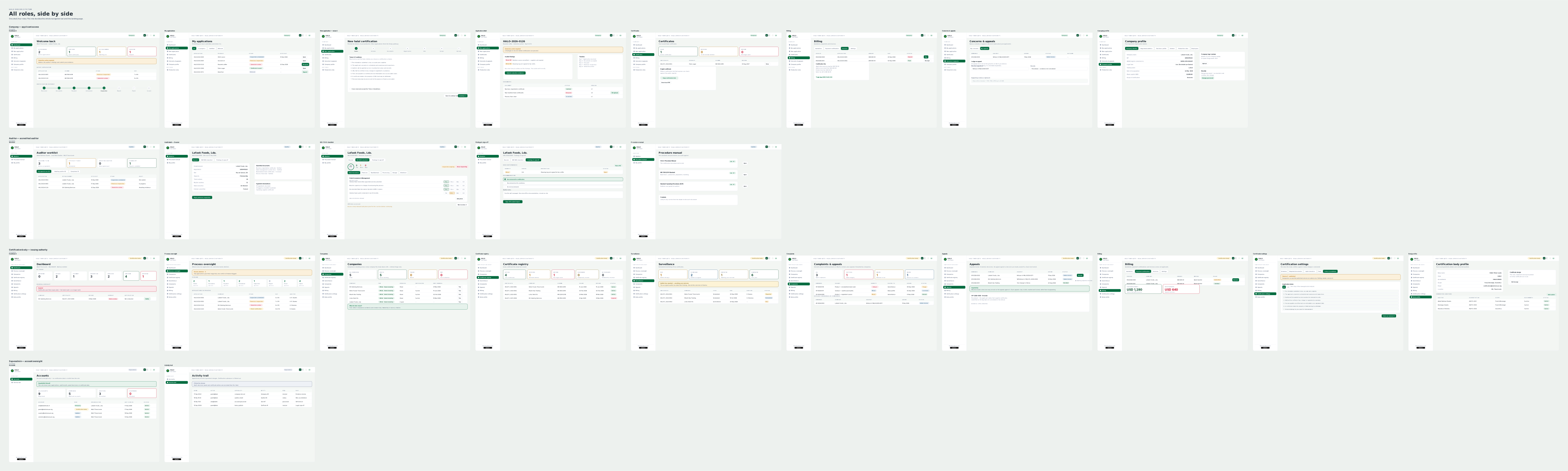
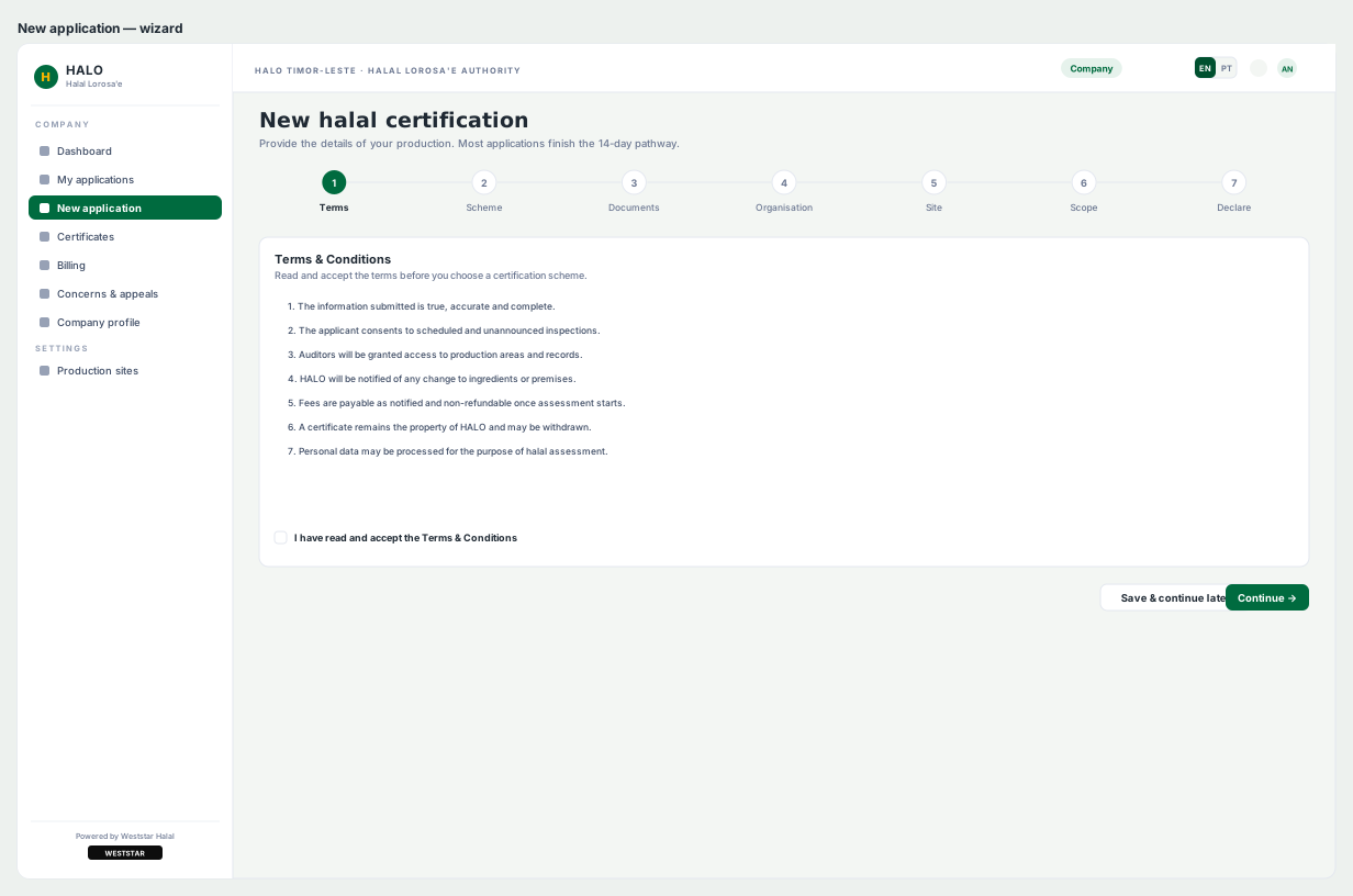
Twenty-five portal pages drawn as 1200 × 760 desktop frames — every one with the real shell: that role's sidebar with the correct item highlighted, the topbar, the page head, and the page's actual content. Labels, column headers, stage names and reference formats are the production ones, so the boards read as the application rather than as grey wireframes. Each screen is a named group containing Sidebar, Topbar, Page head and Content, which lets the shell be restyled across a whole board in one selection.
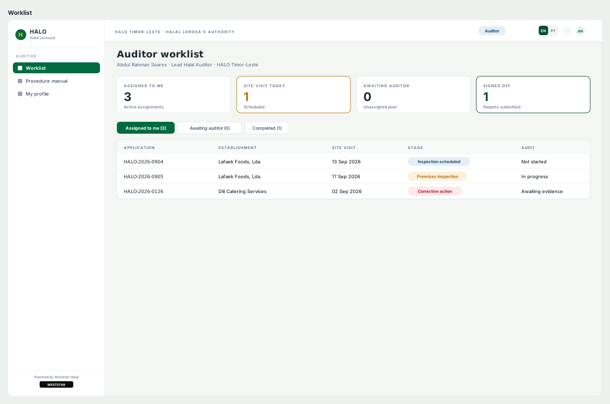
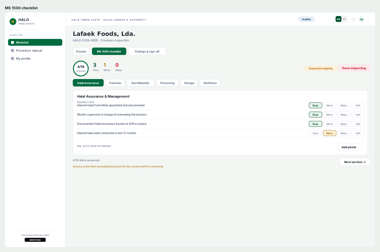
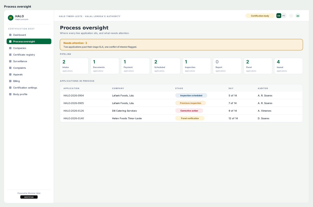
All 25 screens, one row per role. Company 8 · Auditor 5 · Certification body 10 · Superadmin 2. Seeing the four workspaces in one view is how you check that one shell is actually holding them together — the sidebar, topbar and page head stay put while only the navigation set and content change.
Company — Applicant Access
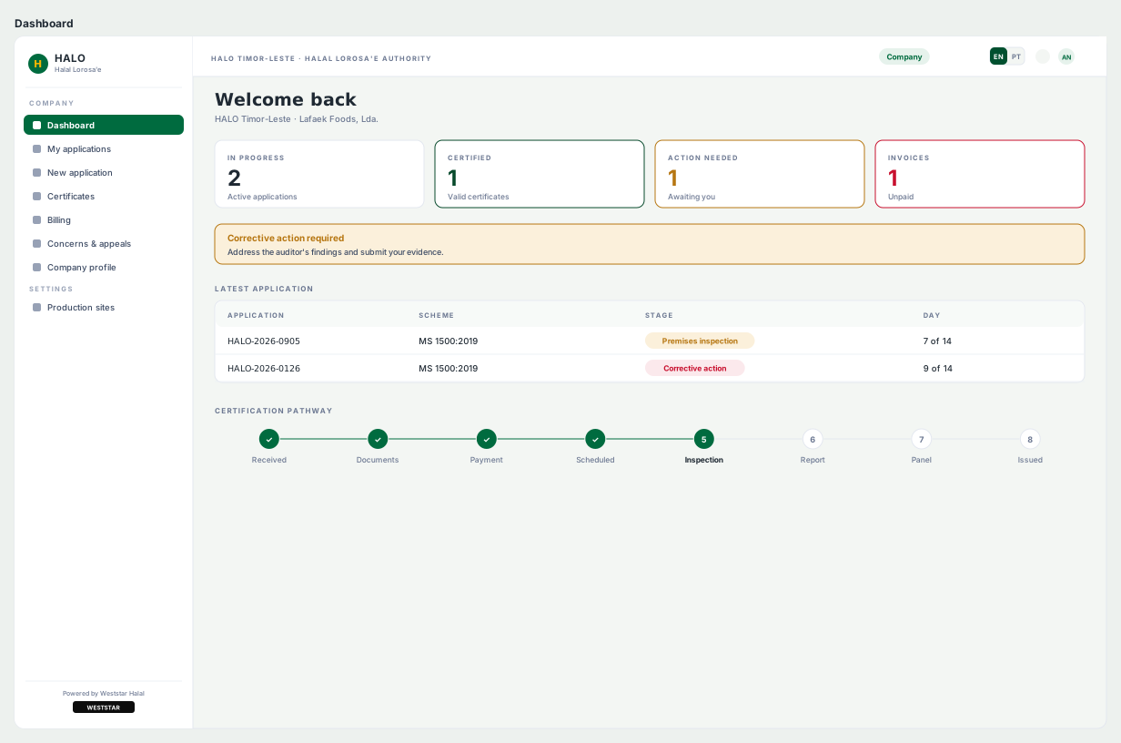
Dashboard. A halal applicant is usually a small food business, not a compliance professional — so the dashboard answers "where is my application and what do I do next" before it offers anything else.New application wizard. Certification paperwork is long, so it is broken into steps with progress always visible. This is the screen where the placeholder rule earns its place — every field hint states a format, never a plausible value that a user might mistake for saved data.
Auditor — Accredited Inspector
Worklist. The auditor's navigation is deliberately the narrowest in the system — three items. Someone standing in a factory with a tablet needs their queue and the checklist, not the full administrative surface.MS 1500 checklist — the core of the product. Every item takes one of four verdicts (Pass / Minor / Major / N/A), the counter tracks 4 of 16 assessed, and a section cannot be left before photo proof is attached. Severity is carried by the tone vocabulary rather than ad-hoc colour, so "Minor" looks the same here as it will on the certification body's oversight screen and in the mobile app. The EN / PT toggle in the topbar is not decoration — Timor-Leste is a Portuguese-speaking jurisdiction and the standard has to be readable in both.
Certification Body — Issuing Authority
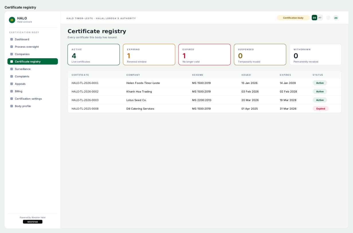
Process oversight. The nine-stage lifecycle made operational — every live application placed against the stage it has reached. This is the screen that justifies defining the lifecycle as a system concept rather than letting each page invent its own stage names.Certificate registry. Gold appears here and almost nowhere else — the tone is reserved for issuance, so the moment a certificate exists is visually distinct from every other state in the product. Reference numbers sit in JetBrains Mono because they get read aloud over a counter and copied into other systems.
Superadmin — Account Oversight
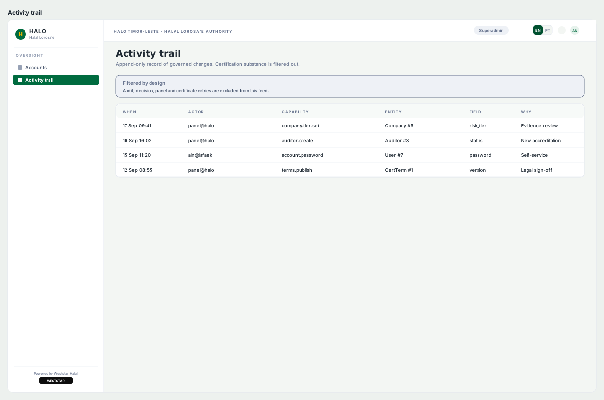
Activity trail. Two screens is the entire superadmin surface, and that restraint is the design decision. An accreditation authority needs a tamper-evident record of who did what; it does not need an administrator who can quietly reach into certification decisions.
Conduct interviews with actual Timorese food producers and business owners to validate whether the application flow matches their mental model of the certification process.
WGHTC (Weststar Global Halal Trading & Certification) needed a professional marketing landing page to present their halal trading and certification services to business audiences. The primary goal was to establish instant credibility and guide visitors toward making an enquiry in a high-trust, competitive market.
🎯
Primary Goal
Convert business visitors into enquiry leads — the page's single measurable success metric.
👥
Target Audience
B2B — food manufacturers, exporters, and businesses seeking halal certification for their products.
🛠
Deliverable
Figma design + HTML/CSS implementation. Responsive across desktop and mobile.
Problem
The Problem
"Business visitors landing on a halal certification company's page need to immediately trust what they see. If the design looks unpolished or the information hierarchy is confusing, they leave before reading a single word."
01
Trust Gap
Halal certification is a high-trust service — the design needed to signal authority and professionalism immediately above the fold.
02
Unclear CTA Path
Visitors needed a clear, low-friction path to enquire — without being overwhelmed by too much information.
03
Service Clarity
Trading and certification are two different services — they needed clear separation without fragmenting the page.
Solution
The Solution
🏆
Trust-First Hero
Certifications, standards, and value proposition above the fold — credibility signals before any service detail.
📋
Clear Service Sections
Trading and certification presented in separate, clearly labelled sections — no information overload.
📞
Persistent CTA
Enquiry CTA repeated at hero, mid-page, and footer — accessible at every scroll depth.
Typography & Colour
Visual Language
Typography
[ Add your WGHTC typography — which font(s) did you use? What sizes for headings, body, labels? Add a Figma type scale screenshot. ]
Colour Palette
[ Add your WGHTC colour palette — swatches with hex codes. What was the primary, secondary, and accent colour? Why those colours for a halal trading brand? ]
UX Research & Insights
Research Approach
🔍
Competitor Analysis
[ Describe which competitor landing pages you reviewed — what did they do well, what gaps did you identify that informed your design decisions? ]
🧠
Visitor Journey Mapping
Mapped the B2B visitor's mental journey: Arrive → Scan for credibility → Understand the service → Trust the brand → Take action. Each section of the page maps to one stage.
Key Insights
3s
Average time a B2B visitor decides whether to stay or leave a landing page
↑
Trust signals above the fold increase conversion rate — credibility must come before service detail
3×
CTA repeated at hero, mid-page, and footer to catch visitors at different decision moments
Design Challenges
Establishing trust instantly for an unfamiliar brand
WGHTC is a new brand with no existing recognition. The design had to do the trust-building work that brand reputation would normally do — through visual signals (clean layout, authoritative typography, certification badges) rather than brand familiarity.
[ Add a second design challenge you faced — what was hard about this project? ]
[ Describe the challenge and how you addressed it ]
Design Takeaway
What This Project Taught Me
01
Landing page design taught me that UX and marketing design are more connected than they appear. Every layout decision is a conversion decision — where a button sits, how long a paragraph runs, when to introduce social proof.
02
Understanding the visitor's mental journey before designing the page made every section decision clearer — each section answers one question the visitor has in sequence.
03
[ Add your own takeaway from working on WGHTC ]
My Users
User Persona
🏭
[ Add persona name and age ]
[ e.g. Business Development Manager at a Malay food manufacturer looking to export to Gulf markets ]
"[ Add a quote from your persona's perspective ]"
✅ Goals
→ [ Goal 1 ]
→ [ Goal 2 ]
→ [ Goal 3 ]
😤 Frustrations
→ [ Frustration 1 ]
→ [ Frustration 2 ]
→ [ Frustration 3 ]
User Flows
Visitor Journey
✦
Add your WGHTC visitor flow here Land → Scan hero → Read services → View trust signals → Click CTA → Enquiry form Export from Figma and drop the image here
Low-Fidelity Wireframes
Page Structure
🏆
Hero Section Wire
📋
Services Section Wire
📞
CTA / Contact Wire
[ Add your wireframe screenshots — export from Figma and drop here ]
[ List components built — e.g. Hero banner, Service cards, Trust badge row, CTA button variants, Contact form, Footer. Add Figma component screenshot. ]
Final Design
High-Fidelity Screens
✦
Full landing page screenshot [ Add desktop full-page screenshot ]
Desktop
📱
Mobile responsive view [ Add mobile screenshot ]
Mobile
Future Iterations & Next Steps
What's Next
🧪
A/B Test Hero Layouts
Test two hero variations — one leading with the certification standard badge, one leading with the value proposition — to see which drives more enquiry clicks.
💬
Add Social Proof Section
Once WGHTC has certified clients, add a client logo strip and testimonials to reinforce trust at the mid-page decision point.
📊
Analytics & Heatmaps
Install Hotjar or Microsoft Clarity to track scroll depth, CTA click rates, and drop-off points — then iterate based on real visitor behaviour.
Next Project
Attendance & Leave System →
→
← Back to Projects
✦ Case Study 04 · Real Project
Attendance & Leave Management System
End-to-end HR UI replacing fragmented manual tracking with a self-service dashboard for employees, HR, and managers.
🎨 UI/UX Designer📅 July 2025 – Present🛠 Figma · Laravel👥 Solo designer
About the Project
What is this system?
An internal HR management tool for Weststar Engineering that replaces a fragmented manual process — email requests, spreadsheet tracking, and direct HR queries — with a centralised web-based system. Three user groups are served: employees (self-service leave tracking), managers (approval dashboard), and HR admins (reporting and management).
🎯
Core Goal
Reduce HR workload from repetitive leave queries by giving employees self-service access to their own data.
🛠
Tools
Figma (design + prototype), Laravel (implementation by dev team).
👥
Users
Employee · Manager · HR Admin — three roles, three views.
Problem
The Problem
"Employees had no reliable way to check their leave balance at a glance — leading to repeated HR queries, manual errors, and frustration on both sides."
01
No Self-Service
Employees contacted HR directly for leave balance checks — consuming HR time on repetitive queries.
02
Manual Errors
Email-based requests were prone to miscommunication, incorrect dates, and data entry mistakes.
03
Approval Delays
Managers had no central view of pending requests, causing slow and inconsistent approval cycles.
Solution
The Solution
📊
At-a-Glance Dashboard
Summary card showing remaining leave, pending requests, and today's attendance — no multi-screen navigation.
📋
Simplified Leave Form
Reduced from 12 to 6 fields by grouping related inputs and using smart defaults — cutting completion time.
✅
Manager Approval View
All pending requests in one sortable table — by date, department, status — enabling faster decisions.
Typography & Colour
Visual Language
Typography
[ Add your typography — which font(s), sizes, and weights did you use? Add a type scale screenshot from Figma. ]
Colour Palette
[ Add your colour palette — swatches with hex codes. What were the primary, status (success/warning/error), and neutral colours? Why did you choose them for an internal HR tool? ]
UX Research & Insights
Research Approach
🔍
Workflow Observation
Mapped the existing leave request process by observing how HR staff handled requests via email and spreadsheets — identifying where time was wasted and errors were introduced.
🗣️
Stakeholder Conversations
Talked to HR staff to understand their biggest pain points before designing anything — validating that "leave balance queries" was the #1 drain on their time.
Key Insights
12→6
Leave form fields reduced by grouping related inputs and applying smart defaults
#1
Pain point: employees couldn't check their own leave balance without calling HR
3
User roles each needing a different view of the same underlying data
Design Challenges
Making a data-heavy system feel simple without losing functionality
HR systems inherently deal with complex data — dates, types, statuses, approval chains. The challenge was surfacing the right information at the right time without exposing the full complexity of the data model to every user. Progressive disclosure and role-based views were the solution.
Designing data tables that work on mobile
Leave request tables with multiple columns (Name, Date, Type, Status, Action) collapse poorly on mobile. The solution was a card-based view on small screens — each row becomes a stacked card — preserving readability without horizontal scrolling.
Design Takeaway
What This Project Taught Me
01
Small UX decisions — like grouping form fields or adding smart defaults — have a disproportionate impact on real user behaviour and error rates.
02
Designing with developers from the start (not handing off at the end) surfaces technical constraints early enough to be addressed in the design, not after implementation.
03
Data tables are one of the hardest responsive design challenges. Card-view fallbacks on mobile deserve to be designed as a first-class screen, not an afterthought.
My Users
User Persona
👩💼
Amirah, 31 — HR Executive
Weststar Engineering · manages attendance for 80+ employees
"I spend half my day answering the same leave balance questions. I need a system where employees can help themselves."
✅ Goals
→ Reduce repetitive HR queries
→ Approve requests faster
→ Generate reports easily
😤 Frustrations
→ No single source of truth
→ Slow email-based approvals
→ Employees submit wrong dates
User Flows
How Users Navigate
🖥️
Add your attendance system user flow here Employee: Login → Dashboard → Apply Leave → Confirmation Manager: Login → Pending Requests → Review → Approve/Reject Export from Figma and drop the image here
Low-Fidelity Wireframes
Early Structure
📊
Employee Dashboard Wire
📋
Leave Form Wire
✅
Manager Approval Wire
[ Add your wireframe screenshots — export from Figma and drop here ]
Grid & UI Kit
Grid System
[ Describe your grid — column count at desktop/tablet/mobile. Add Figma grid screenshot. ]
UI Kit Components
Components built: Leave balance card, Status chips (Approved/Pending/Rejected), Leave request form, Data table (desktop) + card view (mobile), Date picker, Notification bar. [ Add Figma component screenshot ]
Run interviews with HR staff and employees after first month of use — validate whether the self-service dashboard actually reduced direct HR queries.
🧪
Usability Testing on Beta
Task-based testing: can an employee check leave balance in under 10 seconds? Can a manager approve all pending requests in under 2 minutes?
📱
Mobile App Version
Explore a lightweight mobile companion app so employees can apply for leave and check their balance directly from their phone without opening a browser.
Next Project
NasiGo Food Delivery App →
→
← Back to Projects
✦ Case Study 05 · Concept · Full UX Process
NasiGo 🍛
Malay food delivery app for university students on a budget. Full UX process — research, persona, competitive analysis, user flow, wireframes, and final UI.
🎨 Solo Designer📅 Concept Project🛠 Figma · FigJam👥 University students
About the Project
What is NasiGo?
NasiGo is a self-initiated concept mobile app solving a specific, underserved problem: university students in Malaysia who want affordable, familiar Malay food delivered quickly — without the high fees and minimum orders of GrabFood, FoodPanda, and Shopee Food. This project covers the full UX process from problem discovery to final high-fidelity screens.
🎯
Design Goal
Design a mobile food ordering app that makes affordable Malay food delivery feel as easy and cheap as ordering from a friend.
💡
Key Differentiator
Budget meal filter (under RM10) + Malay food default — two features no existing major platform offers together.
📱
Platform
Mobile-first (iOS/Android). 94% of target users access food apps exclusively on mobile — never desktop.
Problem
The Problem
"University students want affordable Malay food delivered fast — but existing apps are expensive, have high minimum orders, and barely surface local Malay restaurants."
01
High Delivery Fees
72% of students said high fees stop them from ordering online — a critical barrier for budget-constrained users.
02
No Budget Filter
GrabFood, FoodPanda, Shopee Food — none have a dedicated budget meal filter. Students scroll endlessly for affordable options.
03
Malay Food Underserved
81% prefer Malay cuisine but say it's underrepresented on major platforms — dominated by Western fast food chains.
Solution
The Solution
💸
Budget Meal Filter
Price range slider on search — filter by "Under RM10" in one tap. The #1 differentiator vs competitors.
🍛
Malay Food Default
Home screen surfaces nearby Malay restaurants first — not sponsored content — so students find what they want immediately.
📱
Sticky Bottom Nav
Home · Search · Orders · Profile always reachable — designed for one-handed use between classes.
Typography & Colour
Visual Language
Typography
Inter throughout — one family, four weights. Display 25/800 for artboard titles, 16/800 for screen headings, 12–13/700 for labels and prices, 9–10/400–500 for body and metadata. Section labels sit at 7.5/700 with 1.1px tracking so they read as structure rather than content. Prices are always weight 800 — on a budget-led app, the number is the message.
Colour Palette
#F5B921
Primary
#1A1A2E
Ink
#A8710A
Accent
#FFF4D6
Tint
Golden amber on deep navy — warm enough to read as food, dark enough to stay legible. The bright gold carries surfaces and buttons with navy text on top; the deeper #A8710A carries small text on white, where the bright gold would fail contrast. Coral and green appear only as status, never as brand.
UX Research & Insights
Research & Findings
🎤
Informal Student Interviews
Talked to university students about their food ordering habits — asking what apps they use, what stops them from ordering more, and what they wish existed. Key finding: budget and Malay food availability emerged as universal pain points.
📊
Competitive Analysis
Mapped GrabFood, FoodPanda, and Shopee Food against 6 criteria: budget filter, Malay food focus, low minimum order, student promos, UI simplicity, and pre-scheduled orders. NasiGo addresses every gap identified.
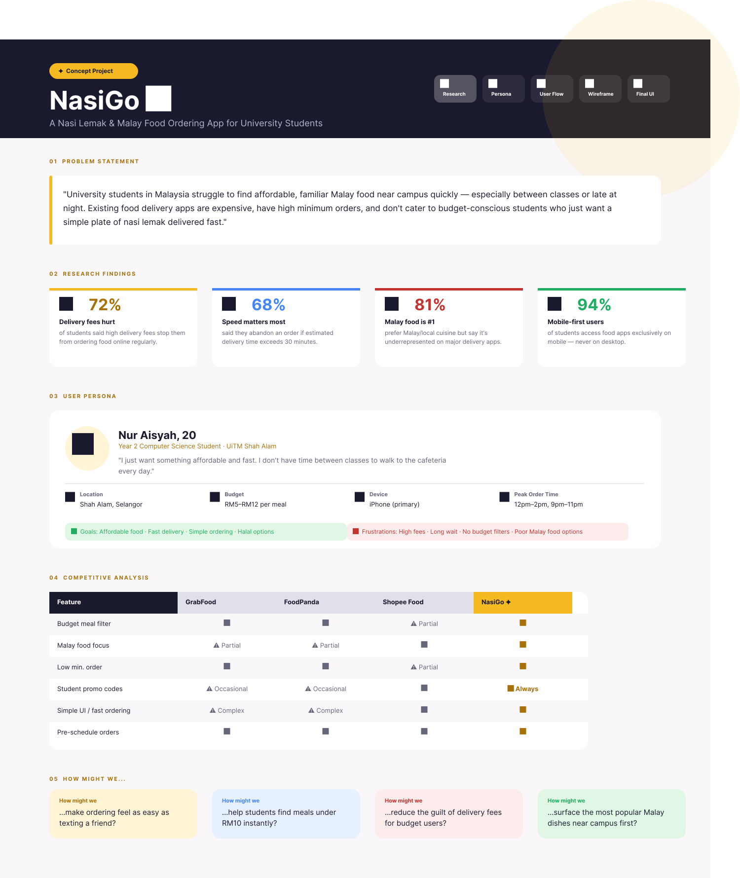
The full discovery artboard — problem statement, findings, persona, competitive matrix and How Might We prompts.Open full size ↗
Key Insights
72%
Students stopped from ordering by high delivery fees
68%
Abandon orders if estimated delivery exceeds 30 minutes
81%
Prefer Malay cuisine but say it's underrepresented on major apps
94%
Access food apps exclusively on mobile — never desktop
How Might We…
How might we
…make ordering feel as easy as texting a friend?
How might we
…help students find meals under RM10 instantly?
How might we
…reduce the guilt of delivery fees for budget users?
How might we
…surface the most popular Malay dishes near campus first?
Design Challenges
Designing for one-handed use between classes
Students typically order during short breaks — standing, one hand free, limited time. Every key action (find food, add to cart, checkout) needed to be reachable without repositioning the phone. Sticky bottom navigation and large tap targets were the primary solutions.
Making "budget" feel positive, not cheap
The budget filter was the core differentiator — but designing it as a prominent feature risked making the app feel "low-end." The solution was to frame it as "smart filtering" and use clean, modern visual design to signal quality despite the budget focus.
Design Takeaway
What This Project Taught Me
01
Competitive analysis before wireframing is non-negotiable. Understanding what GrabFood and FoodPanda do badly was what made NasiGo's differentiators obvious — without that research I would have designed another generic food delivery app.
02
Owning the entire UX process from discovery to final screens gave me a much deeper understanding of how early research decisions ripple through to final UI choices.
03
How a feature is framed visually changes how users feel about it — "budget filter" can feel cheap or smart depending on the design quality around it. Tone is set by the whole, not a single component.
My Users
User Persona
👩🎓
Nur Aisyah, 20 — University Student
Year 2 · UiTM Shah Alam · Budget: RM5–12/meal · iPhone user
"I just want something affordable and fast. I don't have time between classes to walk to the cafeteria every day."
✅ Goals
→ Find meals under RM10 quickly
→ Familiar Malay options nearby
→ Order from phone between classes
😤 Frustrations
→ Delivery fees eat into her budget
→ No budget filter on existing apps
→ Long wait times, high minimums
User Flows
Full Ordering Flow
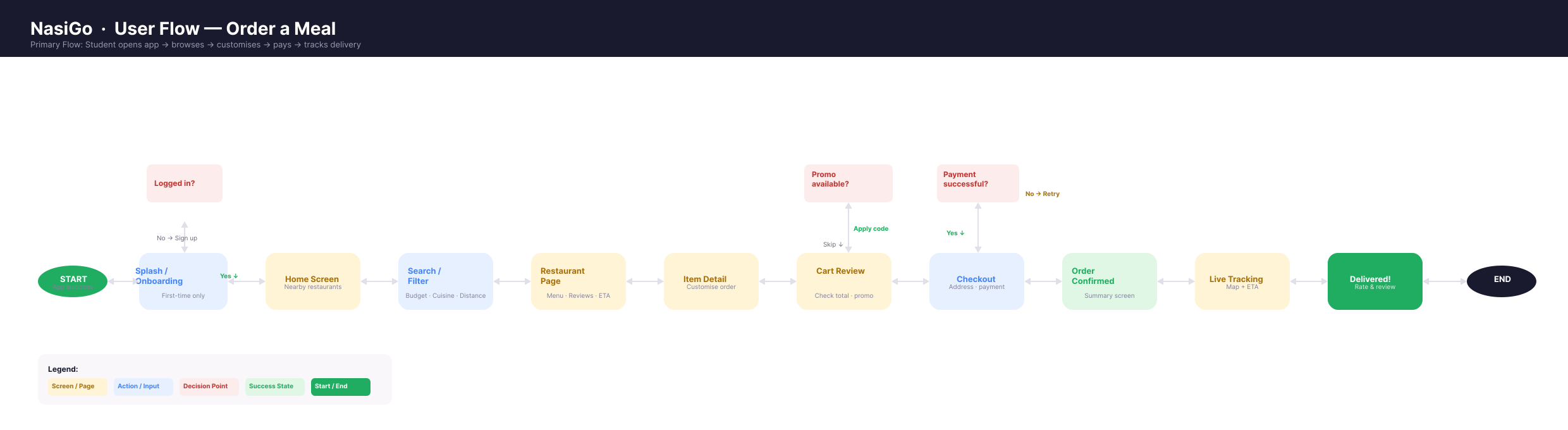
Eleven steps and three decision points — login, promo and payment retry. Scroll to follow the full path.Open full size ↗
Low-Fidelity Wireframes
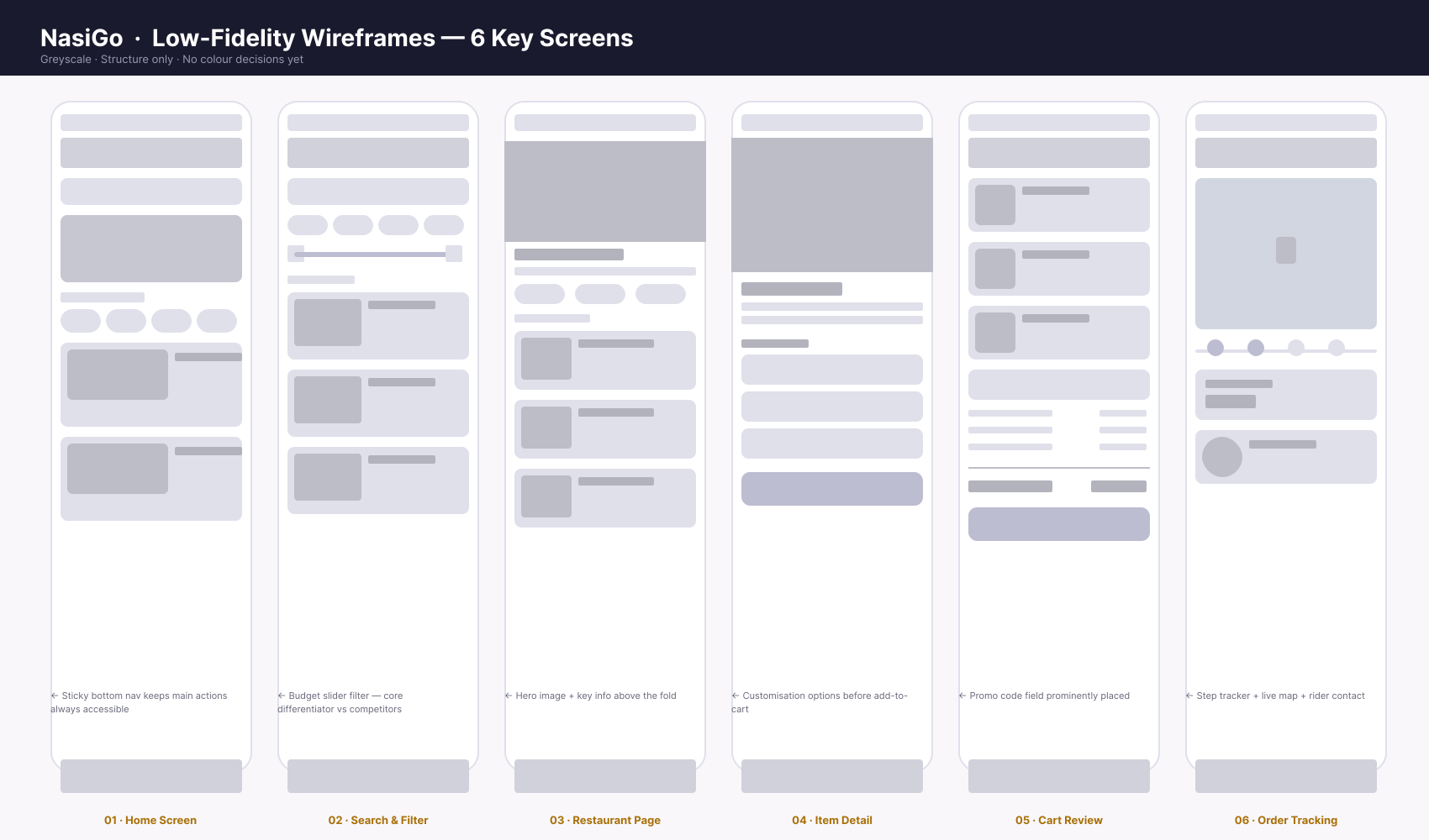
6 Key Screens
Greyscale, structure only — no colour decisions yet. Each frame carries the one layout note it was built to prove.Open full size ↗
Grid & UI Kit
Grid System
Mobile-first, 375px base (iPhone SE). 4-column grid with 16px gutters. Single-column layout throughout. Touch targets minimum 44×44px for all interactive elements.
UI Kit Components
Bottom navigation bar, Restaurant card, Category chip (filter), Budget slider, Item card + add button, Cart summary row, Quantity stepper, Order status tracker, Rider info card. Each component is shown in use on the high-fidelity artboard below rather than in isolation — the budget slider on screen 02, the quantity stepper on 04, the order status tracker and rider card on 06.
Final Design
High-Fidelity Screens
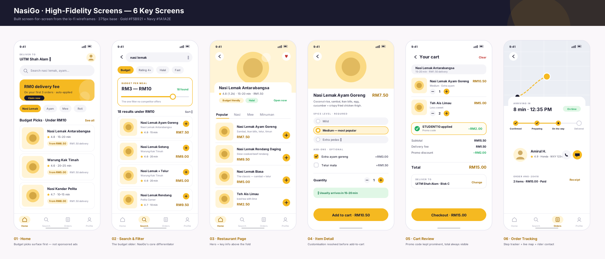
Every hi-fi screen maps one-to-one onto a wireframe — same six screens, same layout decisions, now carrying the gold-and-navy system. Nothing was added at this stage that the wireframes had not already argued for.
Six screens in the gold-and-navy system, built directly from the lo-fi frames above.Open full size ↗
01 · Home
Budget Picks under RM10 sit above the fold — nearby Malay restaurants first, not sponsored placements. Sticky bottom nav for one-handed use.
02 · Search & Filter
The budget slider, given its own card and a live result count. This is the screen the whole concept rests on.
03 · Restaurant Page
Hero, rating, ETA and delivery fee above the fold; a "Budget friendly" badge carries the positioning without saying "cheap".
04 · Item Detail
Spice level and add-ons resolved before add-to-cart, with the running total written into the button itself.
05 · Cart Review
Promo code kept prominent and shown in its applied state, so the saving is visible at the moment of commitment.
06 · Order Tracking
Four-step tracker, live map and rider contact — answering the 68% who abandon when delivery time is unclear.
Future Iterations & Next Steps
What's Next
🎤
User Interviews & Quantitative Surveys
Run structured interviews with 10 university students and a wider survey (50+) to validate the budget filter as the #1 differentiator — and identify any additional pain points not covered in the initial research.
🧪
Usability Testing on Beta
Task-based testing: can a new user find a meal under RM10 and complete checkout in under 90 seconds? Measure task completion rate, error rate, and time-on-task across 5 participants.
💬
Community Feedback
Share the prototype in university student WhatsApp and Telegram groups — collect qualitative feedback on the budget filter UX and whether the Malay food focus feels meaningful to them.
Next Project
Glukosa Meal Diary →
→
← Back to Projects
✦ Case Study 06 · Healthcare · Reframed
Glukosa 🍽️
Meal plan diary for diabetic patients — expert system suggests low-sugar Malay dishes based on glycemic index. Reframed from chatbot to tap-based daily diary.
Glukosa started as an academic expert system project that recommended low-sugar Malay meals to diabetic patients through a chatbot interface. After evaluating the original approach, I reframed it as a meal plan diary — keeping the expert system logic but replacing the chatbot with a tap-based, visual daily planner far more suitable for older adult users managing a chronic condition daily.
🔄
The Reframe
Chatbot → Diary. Same expert system intelligence, completely different interaction paradigm. The interface changed; the logic stayed.
🧠
Expert System Logic
IF daily carb total + new meal exceeds limit → flag as High or suggest a lower-GI Malay alternative. Rule-based, not ML.
🍛
Malay Food Focus
First diabetes tracking concept built around Malay cuisine — nasi lemak, ikan bakar, ulam — with real GI values for local dishes.
Problem
The Problem
"Diabetic patients need to track meals daily over time. A chatbot requires typing and conversational back-and-forth — too complex for older adult users managing a daily health routine. A diary is more habitual, more visual, and fits how people actually manage their diet."
01
Wrong Interface Model
Chatbot requires typing — a barrier for older adult users (55+) managing a daily health habit on a basic smartphone.
02
No History View
Chatbots don't show patterns over time — patients couldn't see their weekly sugar intake trends or identify problem meals.
03
Malay Food Not Covered
Existing diabetes apps focus on Western food databases — patients eating nasi lemak daily had no relevant guidance.
Solution
The Solution
📅
Calendar Diary View
Colour-coded calendar showing daily meal status (Safe/Moderate/High) — visual weekly pattern at a glance.
🤖
Expert System Suggestions
Tap "Plan Ahead" → system suggests low-GI Malay dishes filtered to remaining daily carb budget. No typing required.
⚡
Instant GI Feedback
Every logged meal shows ✅ Safe / ⚠️ Moderate / ❌ High — with a swap suggestion if the daily limit is exceeded.
Typography & Colour
Visual Language
Typography
Accessibility-first typography — larger base font size (16px+) for older adult users. High contrast text on all backgrounds. [ Add your actual Figma type scale ]
Colour Palette
#1A7A3C
Safe Green
#D97706
Moderate
#C4245E
High / Alert
#E0F5E8
Safe Light
Semantic colour system — green/amber/red directly maps to GI feedback (Safe/Moderate/High). [ Replace with your actual Figma palette ]
UX Research & Insights
Research & Reframe
🔄
Interface Model Analysis
Evaluated the original chatbot interface against the user group's characteristics (older adults, basic tech literacy, daily chronic condition management) — identified fundamental mismatch between interface model and user needs.
🧠
Cognitive Walkthrough
Walked through each screen as Encik Rahman (58, retired teacher, basic smartphone user) — identifying where typing, conversational back-and-forth, and lack of visual history would create friction.
Key Insights
Daily
Habit frequency — the interface must support repetition without cognitive overhead
55+
Target user age group — typing and conversational UI creates unnecessary barriers
2
Core loops: Plan Ahead (expert suggestions) + Log Eaten (instant GI feedback)
Showing a patient that their meal is "High" risk could cause anxiety or discourage logging altogether — the opposite of the desired behaviour. The design had to present GI feedback as actionable guidance ("here's what to eat instead") rather than a judgement ("you ate the wrong thing"). Colour, tone, and copy all had to work together to achieve this.
Designing for daily habit formation, not one-time use
Most apps are designed for engagement — but a diary for chronic condition management needs to be so frictionless that logging a meal feels automatic. Every extra tap is a reason not to log. The one-tap "confirm as eaten" feature for planned meals directly addresses this.
Design Takeaway
What This Project Taught Me
01
The right interface model matters as much as the right feature set. The expert system logic was sound — it was the chatbot wrapper that failed the user. Reframing from chatbot to diary wasn't a redesign; it was a UX decision about which interaction pattern fits the user's actual life.
02
For older adult users managing a chronic condition, habitual and visual beats conversational every time. Interface choices must match the user's daily context, not showcase the technology.
03
How feedback is framed changes behaviour. "Your meal is High — here's a better option" produces a different response than "You ate something dangerous." Tone is a UX decision, not just a copywriting one.
"My doctor told me to watch my sugar, but I don't know which of my favourite dishes are actually safe. I just want something simple to track what I eat every day."
✅ Goals
→ Eat familiar Malay food safely
→ Track daily sugar intake simply
→ Build healthy habits gradually
😤 Frustrations
→ Doesn't know GI of local dishes
→ Confusing nutrition labels
→ Forgets to track meals
User Flows
Plan & Log Dual Flow
🍽️
Add your Glukosa user flow here Loop A: Plan Ahead (expert suggestions) · Loop B: Log What Was Eaten (instant GI feedback) Export from FigJam and drop the image here
Low-Fidelity Wireframes
Diary Screen Structure
📅
Diary Home Calendar View Wire
🤖
Plan Ahead Suggestions Wire
✅
Log Meal GI Feedback Wire
[ Add your wireframe screenshots — export from Figma and drop here ]
Grid & UI Kit
Grid System
Mobile-first, 375px base. Accessibility-first: minimum 48×48px touch targets (larger than standard 44px — accommodating older adult motor control). High contrast ratios (WCAG AA minimum). [ Add Figma grid screenshot ]
Create & Log a Meal [ Add screenshot — food search, expert suggestion list, GI feedback (✅⚠️❌), swap suggestion ]
Create and Publish (Log Meal)
👤
User Profile [ Add screenshot — health profile, HbA1c target, daily carb limit, logged history ]
Profile
Future Iterations & Next Steps
What's Next
🎤
User Interviews & Quantitative Surveys
Conduct interviews with Type 2 diabetic patients (50+) and their family caregivers. Run a survey to understand what foods they eat most frequently and whether they've tried any existing tracking apps.
🧪
Usability Testing on Beta
Task-based testing with 5 older adult participants: can they log a meal in under 30 seconds? Can they find and use the Plan Ahead feature without guidance? Measure error rate and time-on-task.
💬
Community Feedback
Share prototype with diabetes support communities (Persatuan Diabetes Malaysia) for feedback on the Malay food database accuracy, GI values, and whether the diary format fits their daily management routine.
Next Project
Meshsenger →
→
← Back to Projects
✦ Case Study 07 · Proof of Concept
Meshsenger 📡
An offline, serverless mobile messenger that relays messages phone-to-phone over Bluetooth LE mesh. No internet, no servers, no accounts — built for situations where infrastructure is unavailable or untrusted.
Meshsenger lets phones within Bluetooth range (~10–100m) communicate with each other — no internet, no servers, no user accounts. Messages hop device-to-device across a mesh network, meaning a phone that can't reach you directly can still reach you via other phones relaying in between.
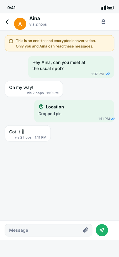
The core product problem isn't networking — it's legibility. Making an invisible ad-hoc network understandable to a normal user. The UI's job is to answer, at a glance: who is nearby, how many hops away they are, whether a message is encrypted, and whether it actually arrived.
🎯
My Role
Directed and integrated AI-generated design output into the codebase. Oversaw design system coherence, made UX transparency decisions, and audited divergent implementations.
Crowded events, infrastructure outages, remote areas, protests — situations where internet is unavailable or untrusted.
Problem
The Problem
"How do you design a UI for a network that's invisible? Users can't see the mesh — they need the interface to tell them who is nearby, how far away they are, whether their message is private, and whether it actually got through."
01
Invisible Infrastructure
Bluetooth mesh networking has no visual equivalent — users have no mental model for hop-based relay. The UI has to build that understanding from scratch.
02
Security Transparency
Messaging apps routinely imply safety they don't provide. Meshsenger needed to be explicit: who can read this message, and when.
03
Three Divergent Truths
The design system, the interactive prototype, and the shipped build disagreed on core screens, navigation, and even the product name — design-systems debt from the start.
Solution
The Solution
🔒
Radical Transparency
Public channel labelled explicitly: "anyone on the mesh can read this." Encryption status is a property of the thread type, not a toggle — no false sense of security.
🎨
Token-First Design System
7 CSS token files ported 1:1 into Dart — keeping the Flutter app and web component library visually consistent from a single source of truth.
⚙️
Design-to-Figma Pipeline
Node.js generator produces layered Figma-importable SVG artboards and Tokens Studio JSON directly from CSS tokens — design documentation as a build artifact, not a hand-maintained file.
Design System
Design System Visual Language
The design system is generated rather than drawn by hand. A Node.js pipeline reads the seven CSS token files and the brand sheet, then emits layered Figma-importable SVG artboards alongside Tokens Studio JSON. The rule the board states about itself is the one that matters: nothing here is invented — every value traces back to a token file or the brand sheet.
The generated board, end to end. Six panels — brand, colour, dark palette, type, space/radius/elevation, components — emitted as one artboard from the token files. Scroll sideways to move across it; each panel is shown full size below.
Brand
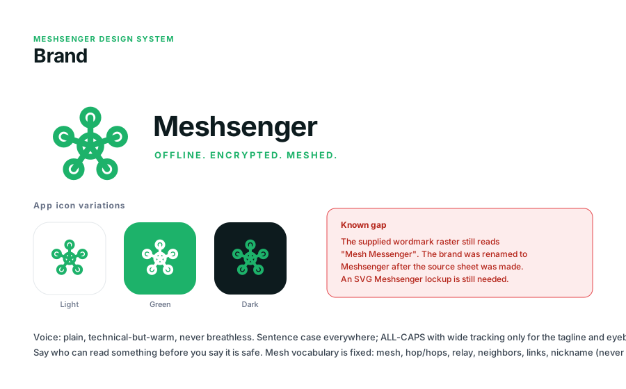
The mark is the product idea drawn at its simplest — one centre node linked to five neighbours. Three app icon variants cover light, green and dark placements. Voice is fixed on the same panel as the mark: plain and technical-but-warm, sentence case everywhere, with ALL-CAPS and wide tracking reserved for the tagline and section eyebrows.
Carried as a known gap, not hidden. The supplied wordmark raster still reads "Mesh Messenger" — the product was renamed to Meshsenger after the brand sheet was made. The board flags this in red on the brand panel rather than quietly shipping a stale asset. An SVG Meshsenger lockup is still outstanding.
Colour
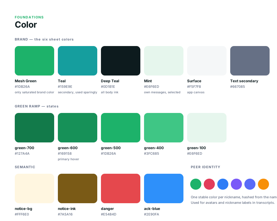
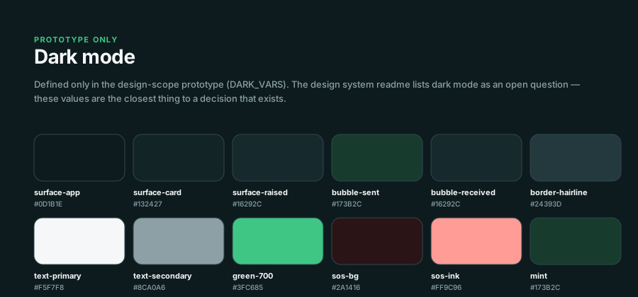
Mesh Green #1DB26A is the only saturated colour in the system. Everything else is structural — Deep Teal #0D1B1E for all body ink, Surface #F5F7F8 for the app canvas, Mint #E6F6ED for own messages and selected states. A five-step green ramp covers interaction states, and four semantic colours carry notices, danger and delivery acknowledgement. The six peer colours are hashed from the nickname, so a peer keeps the same colour on every device with no server assigning one — identity that survives having no backend.Dark mode exists in the prototype only. These twelve values live in the design-scope prototype as DARK_VARS, while the system readme still lists dark mode as an open question. Labelling them "prototype only" was the deliberate call: a half-decided theme recorded honestly is more useful to a developer than one presented as settled.
Typography
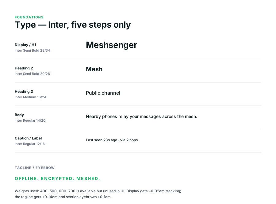
Inter, five steps, three weights. 28/34 display down to 12/16 caption — deliberately few, on the basis that a messaging screen needing a sixth size usually needs simplifying instead. Weight 700 is available but goes unused in UI. Only the display step and the tagline get custom tracking.
Space, Radius, Elevation & Motion
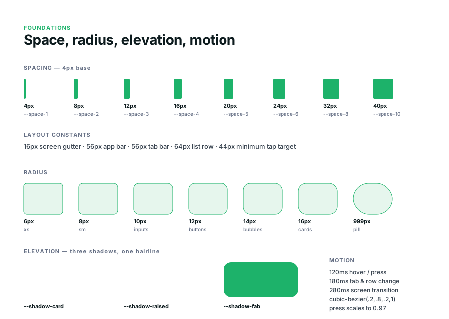
Every corner is tied to a component role. 10px inputs, 12px buttons, 14px bubbles, 16px cards, 999px pills — so a new component inherits its radius from what it is rather than from a designer's eye that day. Layout constants are fixed the same way: 16px screen gutter, 56px app bar, 56px tab bar, 64px list row, 44px minimum tap target. Three shadows and one hairline are the entire elevation vocabulary; motion is 120/180/280ms on a single easing curve.
Components
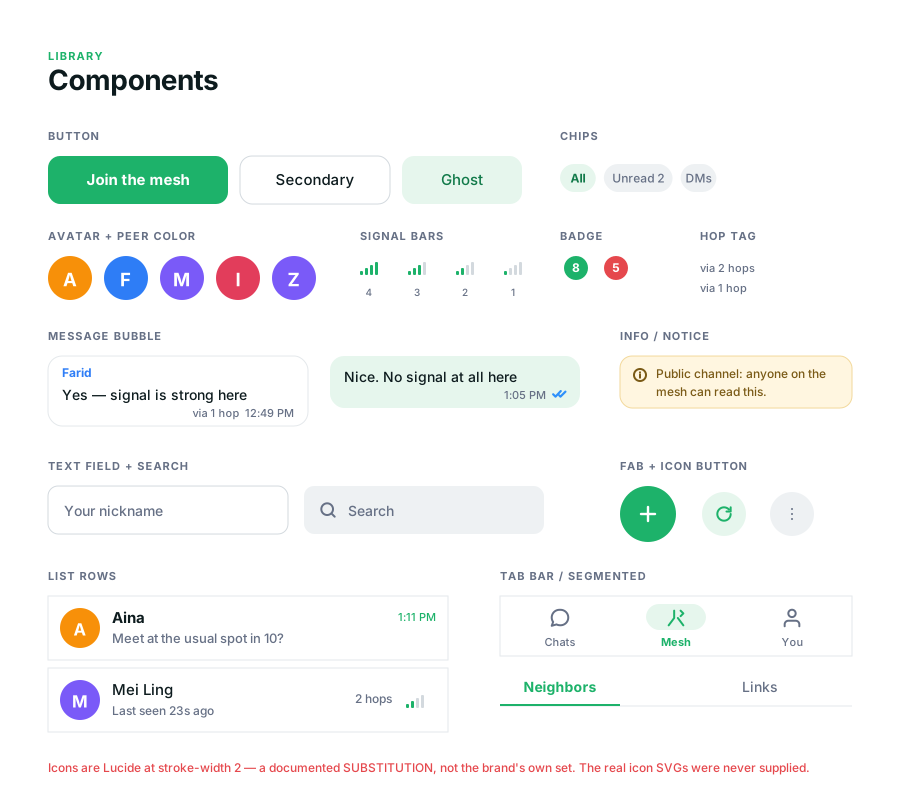
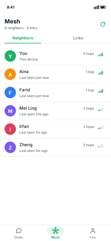
Mesh legibility is built into the components, not bolted on afterwards. Signal bars render link strength in four levels, hop tags read "via 2 hops" in plain words, and the amber notice — "Public channel: anyone on the mesh can read this" — is a component rather than a one-off string, so the trust statement cannot be dropped from a screen by accident. Delivery acknowledgement uses ack-blue, keeping "delivered" visually separate from "encrypted": they are different promises and the UI should not blur them.
Second documented substitution. Icons are Lucide at stroke-width 2 — the brand's own icon SVGs were never supplied. Recording the substitution on the board itself tells a developer these are placeholders, not a design decision worth preserving.
Token Architecture — 7 Files
colors.cssLight + dark semantic tokens
typography.cssScale, weights, line heights
spacing.css4px base grid, named steps
radius.cssCorner radius scale
elevation.cssShadow levels
motion.cssDuration + easing tokens
fonts.cssFont family declarations
All 7 ported 1:1 into Dart — zero manual sync between web kit and Flutter app.
What the Pipeline Emits
SVG artboardsLayered, Figma-importable
Tokens Studio JSON30 light + 15 dark colour vars
6 system panelsBrand → components
Dart token classesConsumed by the Flutter app
Because the board is regenerated from the tokens, the documentation cannot drift out of date — the failure mode that produced three divergent implementations in the first place.
#1DB26A
Mesh Green
#0D1B1E
Deep Teal
#E6F6ED
Mint
#FFF6E0
Notice
#2E90FA
Ack
UX Research & Insights
Research & Design Decisions
🔍
Implementation Audit
Audited three divergent implementations — design system, interactive prototype, and shipped build — documenting conflicts across navigation, identity display, and security surfaces to identify the single-source-of-truth gaps.
🤖
AI-Assisted Design Direction
Directed AI-generated design output from a single brand sheet into a production Flutter codebase — evaluating, selecting, and integrating components while maintaining system coherence.
The Audit, In One View
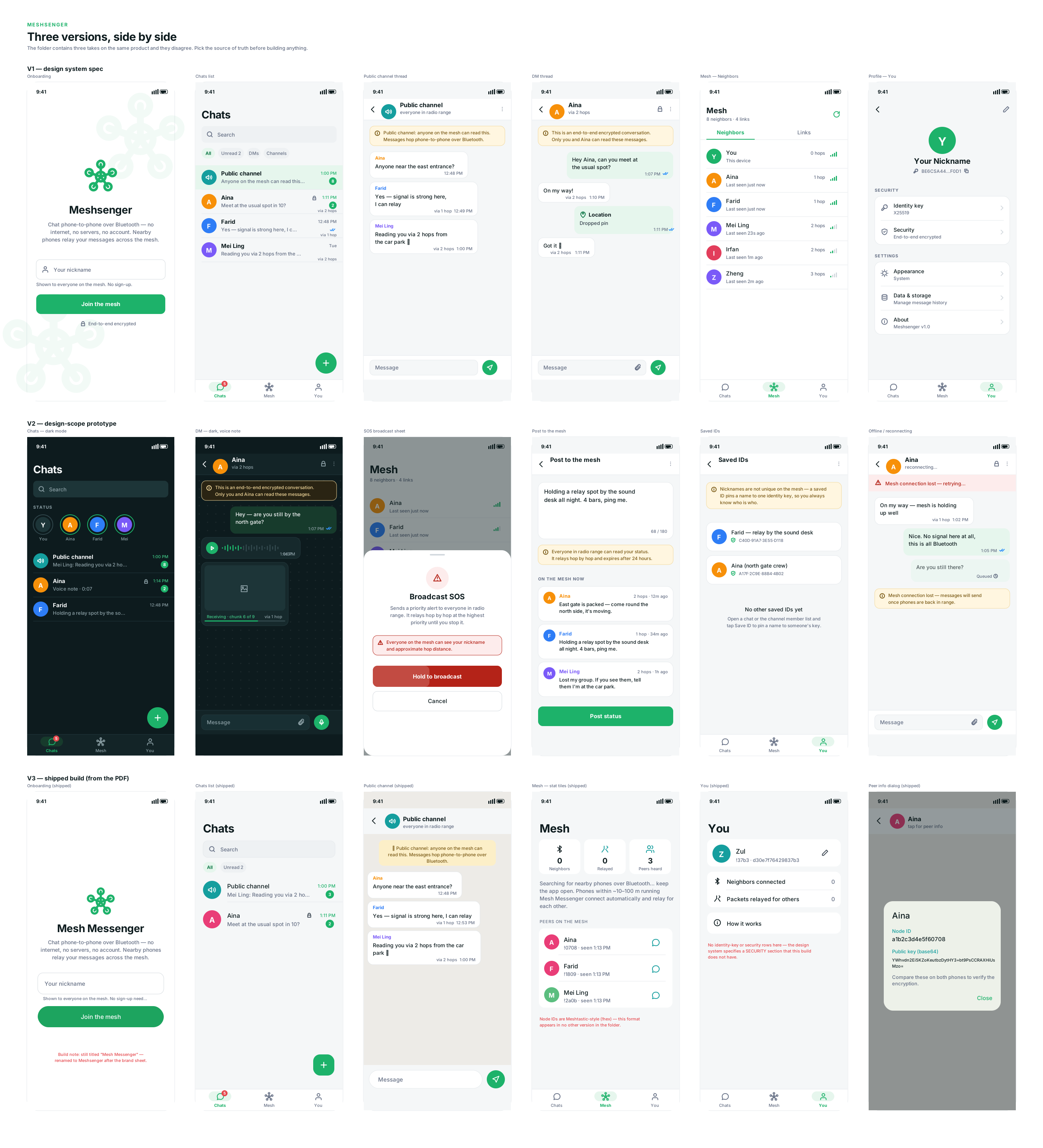
Three takes on the same product, and they disagree. Top row is the design system spec, middle the design-scope prototype, bottom the build that actually runs. Rendering them as one board — rather than describing the differences in a document — is what made the conflicts arguable instead of theoretical. The contradictions are annotated in red directly on the shipped screens.
Where the Three Versions Conflict
Mesh screen Spec uses Neighbors / Links segmented tabs. The shipped build uses three stat tiles — Neighbors, Relayed, Peers heard — plus a "How it works" row.
Peer identity Spec shows nickname, hop count and a signal meter. The build shows Meshtastic-style node IDs (!0708) and a public key you compare across two phones.
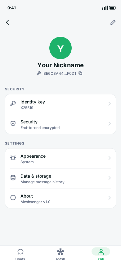
Profile security Spec defines a SECURITY section with identity key and encryption status. The build has no such section at all.
Product name The build and every supplied logo raster still read "Mesh Messenger".
Dark mode Defined only in the prototype. The system readme still lists it as an open question.
Why It Mattered
Each version was internally coherent, which is exactly what made the divergence hard to see — nothing looked broken until the three were placed side by side. The conflicts were not cosmetic either: the spec promises a security surface the build does not have, so the disagreement reached the product's trust model, not just its layout.
The deliverable was not a redesign. It was a comparison that forced a decision — pick one as the source of truth before building anything else on top of it — and a record of what each choice would cost.
Divergent product implementations audited and reconciled into one source of truth
1:1
CSS token-to-Dart parity — zero manual sync required between web and mobile
Design Challenges
Designing trust communication for a security-sensitive product
Most messaging apps imply safety they don't deliver. The deliberate design decision here was the opposite: the public channel is explicitly labelled "anyone on the mesh can read this" — not hidden in settings, not behind a tooltip. Trust statements name who can read a message before claiming it is secure. This principle became part of the written content style guide, applied to every screen.
Directing AI-generated design output without losing coherence
Significant parts of the design system and prototype were AI-generated from a single source brand sheet. The challenge wasn't generation — it was evaluation: deciding what to keep, what to rework, and what to reject, then integrating accepted output into a real Flutter codebase while maintaining token parity. This is a genuinely current, in-demand skill.
Design Takeaway
What This Project Taught Me
01
Trust communication is a design decision, not a copywriting one. How safety is framed — and when — determines whether users make informed decisions or false ones. "Anyone can read this" before "this is private" is the right order, always.
02
AI-generated design output is only as good as the direction and evaluation behind it. The skill is knowing what to accept, what to rework, and what to discard — then integrating the result into a real codebase without losing coherence.
03
Design tokens ported 1:1 into Dart eliminate an entire category of visual drift between web and mobile. The investment in the token pipeline pays back every time a colour or spacing value changes.
04
Three implementations of the same product that diverge on core screens is a design-systems failure, not a development failure. Source-of-truth decisions need to happen before, not after, a codebase grows in multiple directions.
My Users
User Persona
🎪
Daniyar, 26 — Event-Goer
Attends large festivals and events · relies on phone for coordination · frequently loses signal in crowds
"At big events my signal drops completely and I can't reach my friends. I need a way to send messages that doesn't depend on the network being up."
✅ Goals
→ Reach nearby friends when signal is gone
→ Know who is reachable and how far away
→ Send private messages with real privacy
😤 Frustrations
→ No signal in crowded venues
→ Apps that claim "end-to-end encrypted" for everything regardless of context
→ No way to know if a message actually arrived
User Flows
Core Interaction Flows
📡
Add your Meshsenger user flow here Discover nearby peers → View hop distance → Send public message → Start encrypted DM → Check delivery status Export from Figma and drop the image here
Low-Fidelity Wireframes
Screen Structure
📡
Mesh Tab Nearby Peers Wire
💬
Messages Thread List Wire
🔒
DM / Encrypted Thread Wire
[ Add wireframe screenshots — export from Figma and drop here ]
Grid & UI Kit
Grid System
Mobile-first, 390 × 844 artboards (Flutter app). 4px base grid with named spacing steps from the spacing token file. Component sizes driven entirely by design tokens — no magic numbers.
UI Kit — 22 React Components
6 component families: Core (base elements), Messaging (thread + bubble variants), Lists (peer + message lists), Forms (input + controls), Nav (tab + header), Brand (logo + wordmark). Each ships with TypeScript prop definitions and a usage note. [ Add Figma component screenshot ]
Final Design
High-Fidelity Screens
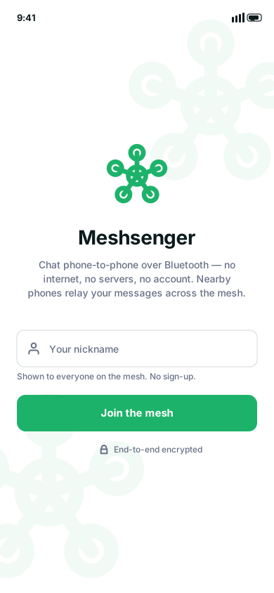
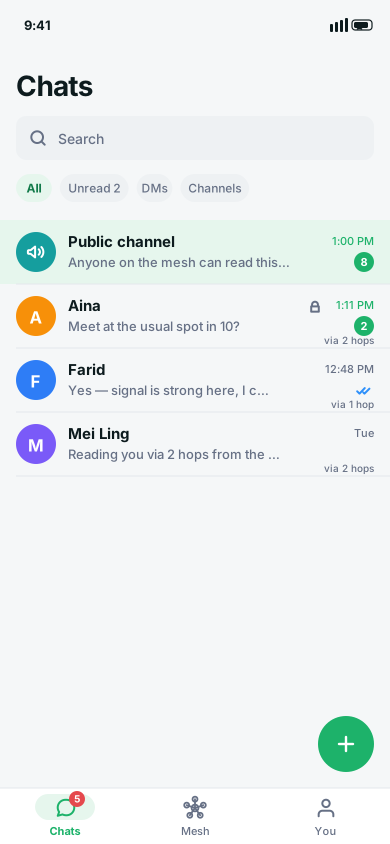
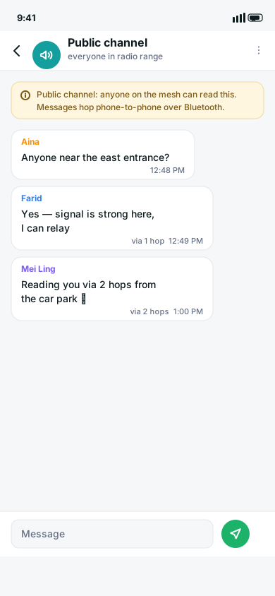
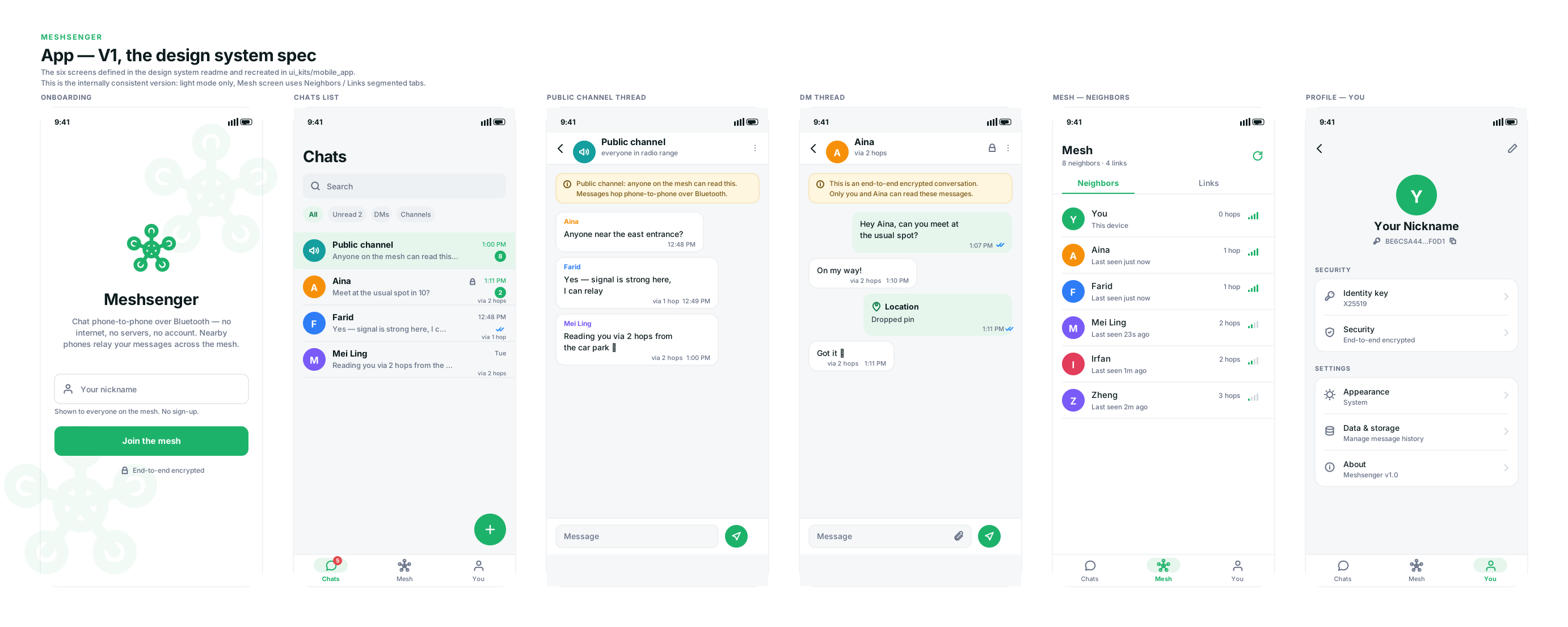
Six screens at 390 × 844, built entirely from the component library — every bubble, row, chip and signal meter on these artboards is a documented component rather than a one-off drawing. This is the version the design system readme specifies, which is what makes it the reference the other two implementations are measured against.
OnboardingOne field, no account. "Shown to everyone on the mesh. No sign-up." sets the privacy model before the user commits to anything.ChatsPublic channel pinned above DMs. A padlock marks encrypted threads; hop tags sit under each preview, so reach is legible before opening.Public channelThe amber notice leads the thread: "anyone on the mesh can read this." Stated before the first message, not buried in settings.Direct messageSame notice component, opposite content — "only you and Aina can read these messages." Encryption is a property of the thread, never a toggle.MeshThe invisible network made visible: every peer carries a hop count and a four-bar meter mapped from raw RSSI. "8 neighbors · 4 links" sits in the header.ProfileA dedicated SECURITY section surfaces the identity key and encryption status as rows — the section the shipped build turned out to be missing.
The six screens as one board. Laid out the way they import into Figma — one frame per screen, layers named, text still editable. Scroll sideways to move across the set.
Content Style Guide
Product Vocabulary & Trust Rules
A written content style guide was produced as part of the design system — standardising mesh-networking vocabulary across every screen and establishing a non-negotiable trust communication rule.
Fixed Product Vocabulary
✅ Usehop, relay, neighbors, links, nickname
❌ Neverusername, server, cloud, account, contact
FormatSentence case throughout — never title case in UI labels
Trust Communication Rule
State who can read a message before claiming it is secure.
✅ "Public channel: anyone on the mesh can read this." ❌ "Your messages are protected." (without saying by what, or from whom)
Future Iterations & Next Steps
What's Next
🎤
User Interviews & Quantitative Surveys
Conduct field research with target users (event-goers, outdoor adventurers, activists) to validate whether the mesh legibility UI — hop count, RSSI bars, encryption labels — maps to their mental model of "who can reach me."
🧪
Usability Testing on Beta
Once the BLE peripheral gap is resolved (enabling real two-phone discovery), conduct task-based testing: can a new user understand who is nearby and whether a message is private within 30 seconds of opening the app?
💬
Community Feedback
Share the prototype with privacy-focused and mesh networking communities (e.g. Meshtastic users, digital rights groups) for feedback on the trust communication model and the public/encrypted channel UX.